

Smart Digital Era!
Friend Breef, in the digital age like now, almost everyone holds a smartphone at any time. From searching for information, shopping online, to accessing social media, everything is done through mobile devices. If your business still relies on websites that are not mobile-friendly, just get ready to lose many potential customers! Mobile-friendly business websites are not just trends, but have become a major need. Google and various other digital platforms now prioritize user experience (user experience) on mobile devices. Making a good first impression with friendly display is not easy, we need a professional, responsive, and seo-friendly website services to help you increase your business online, check our services Website professional.
The majority of mobile devices, dominating?
Friend Breef, the latest data shows that more than 60% of online search is done through mobile devices. This means, if your business website is not optimized for a mobile display, you can lose most of the potential visitors. Websites that are not mobile-friendly tend to make it difficult for users to access content, read text, or menu navigation. As a result, they will soon leave your site and look for other alternatives. Don’t let this happen to your business!
Source: Freepik
Big influence on SEO and level on Google!
Source: Freepik
Google has implemented the system Mobile-First indexingwhich means Google prioritizes the mobile version of a website in determining the search ranking. If your website is not mobile-friendly, it is likely to be unable to compete in search results compared to competitors that have been optimized for mobile devices.
Mobile -friendly websites also have better loading speeds, important factors in SEO rankings. Google greatly prioritizes websites with fast loading so that the user experience is more optimal.
Improve user experience (user experience)
Source: Freepik
Friend Breef, User Experience is everything! Internet users are now increasingly impatient and want ease in accessing information. If your business website has a messy look on a mobile device, the text is too small, or navigation is difficult, they will immediately leave without thinking twice. Conversely, mobile-friendly websites will make user experience more enjoyable. Easy navigation, responsive design, and good access speed will increase user interaction and the possibility of them to make purchases or use your services.
Increase conversion and sales
Websites that are comfortable to access on mobile devices can increase the level of business conversion. Imagine if the potential customer wants to buy a product or use your services, but must pinch the screen to read the text or difficulty finding a buy button. Of course they will be frustrated and eventually leave your website. According to research, mobile-friendly websites have a conversion rate of up to 70% higher than unresponsive.
Increase brand trust and professionalism
Friend Breef, a website is a digital face of your business. If the appearance of the website looks old -fashioned, not responsive, or difficult to use, customers can consider your business unprofessional. Conversely, the website that is optimized for mobile will give the impression of modern, professional, and more trusted by visitors.
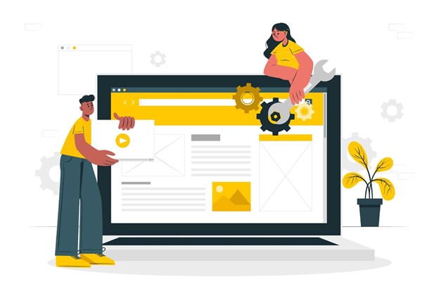
Preparation to face a digital future
Technology continues to grow, and mobile-first trends are getting stronger. Business that wants to remain relevant must be able to adapt to this change. By having a mobile-friendly website, you are preparing a business for long-term growth. In the future, mobile devices may be the only main device used to access the internet.
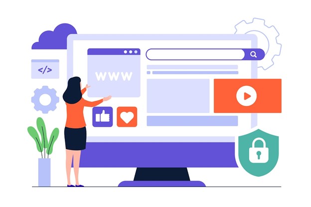
How to create a mobile-friendly website

Source: Freepik
Friend Breef ,, After understanding how important the mobile-friendly website is, here are some steps you can take to optimize your business site:
1. Use responsive design, make sure the website uses responsive design that can adjust the display on various screen sizes, both desktop, tablet, and smartphone.
2. Optimize loading speed, use images with a smaller size, minimize the use of heavy scripts, and use fast hosting services so that loading websites are lighter on mobile devices.
3. Use fonts and buttons that are easy to click, avoid text that is too small and buttons that are difficult to click. Make sure the font size is large enough and the button has enough distance to be comfortable to use on the touch screen.
4. Check with Google Mobile-Friendly Test, Google provides a free tool called Google Mobile-Friendly Test to check whether your website is mobile friendly or not. Use this tool to get suggestions for improvement.
5. Make sure the navigation is simple, Mobile users don’t want to bother looking for a certain menu or button. Make sure the website navigation is simple, clear, and easy to use.
BREEF provides Services/Services Making Professional Website as your Company Profile to increase your customer and business partners with a professional and attractive company profile website. We are ready to help to create your first professional business impression Company Profile Making Services
Conclusion
Friend Breef, a mobile-friendly website is no longer a choice, but a must for every business that wants to develop in the digital age. With the majority of internet users come from mobile devices, website optimization is a smart step to improve user experience, conversion, to SEO rankings. If your business is still using a website that is not responsive, immediately make changes! Don’t let potential customers run to competitors just because your website is difficult to access on a smartphone.
Digital Agency
we specialize in maximizing your online visibility and driving measurable results through strategic SEO solutions. We’re here to help businesses like yours rank higher, attract quality traffic, and achieve long-term growth in the ever-evolving digital landscape.


Закажите душевое ограждение из стекла и получите бесплатный замер
п образные душевые стекла http://www.steklo777777.ru/ .